← All work

Wealth Platform Redesign

EnvestnetDirector / Designer2021–2023108k advisors
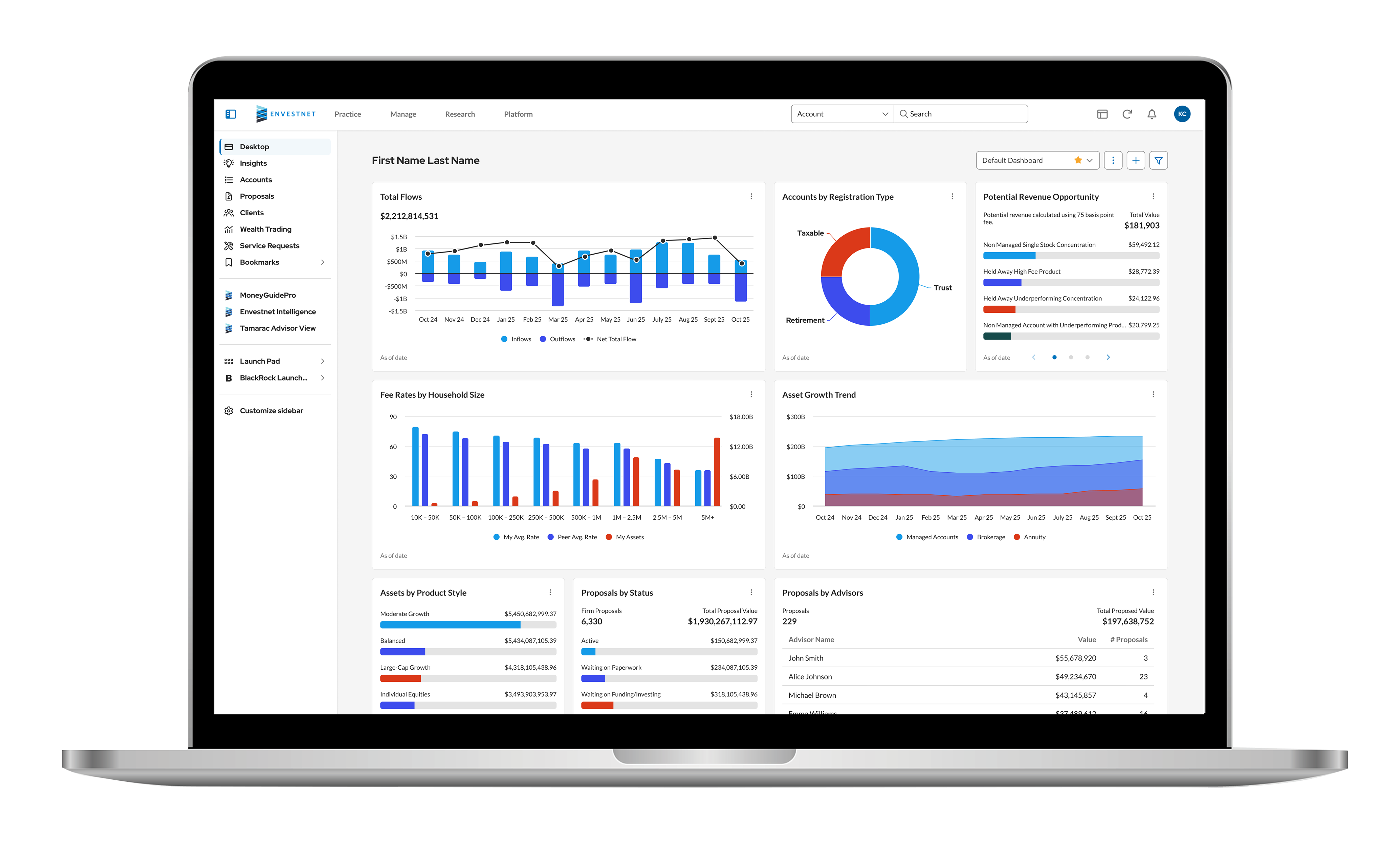
Redesigned advisor dashboard on a laptop
12,428firms converted
1,700pages redesigned
2 yearsto full enablement
The problem

The platform had grown deep, but the interface hadn't kept up. Advisors couldn't find or act on the data they needed, which made the product feel less valuable than it was.

  • Too many clicks for everyday tasks
  • Navigation too complex for the platform's depth
  • Grids missing the features advisors relied on
  • Dashboard widgets that didn't surface insights
  • A dated look and feel
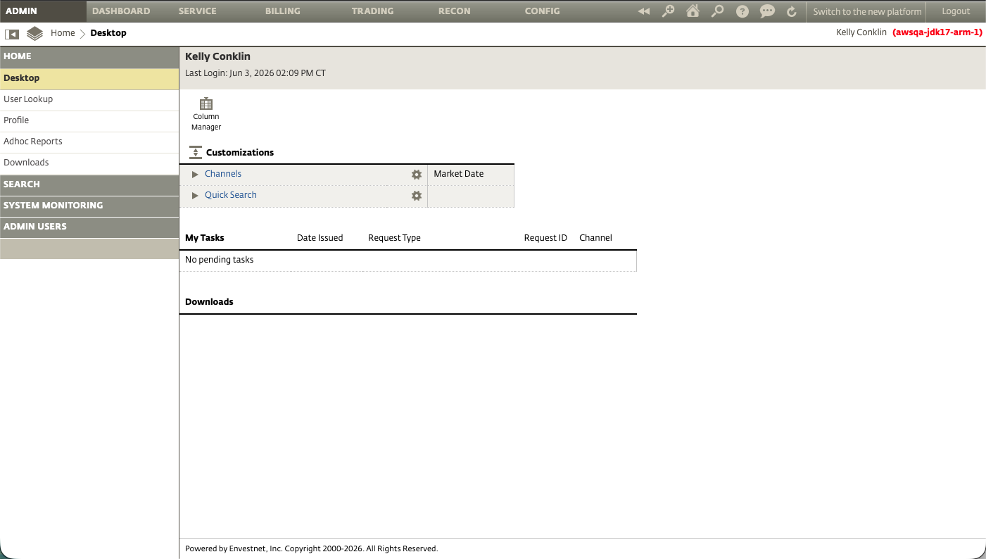
Legacy platform dashboard
BeforeDated UI, deep navigation, unhelpful widgets
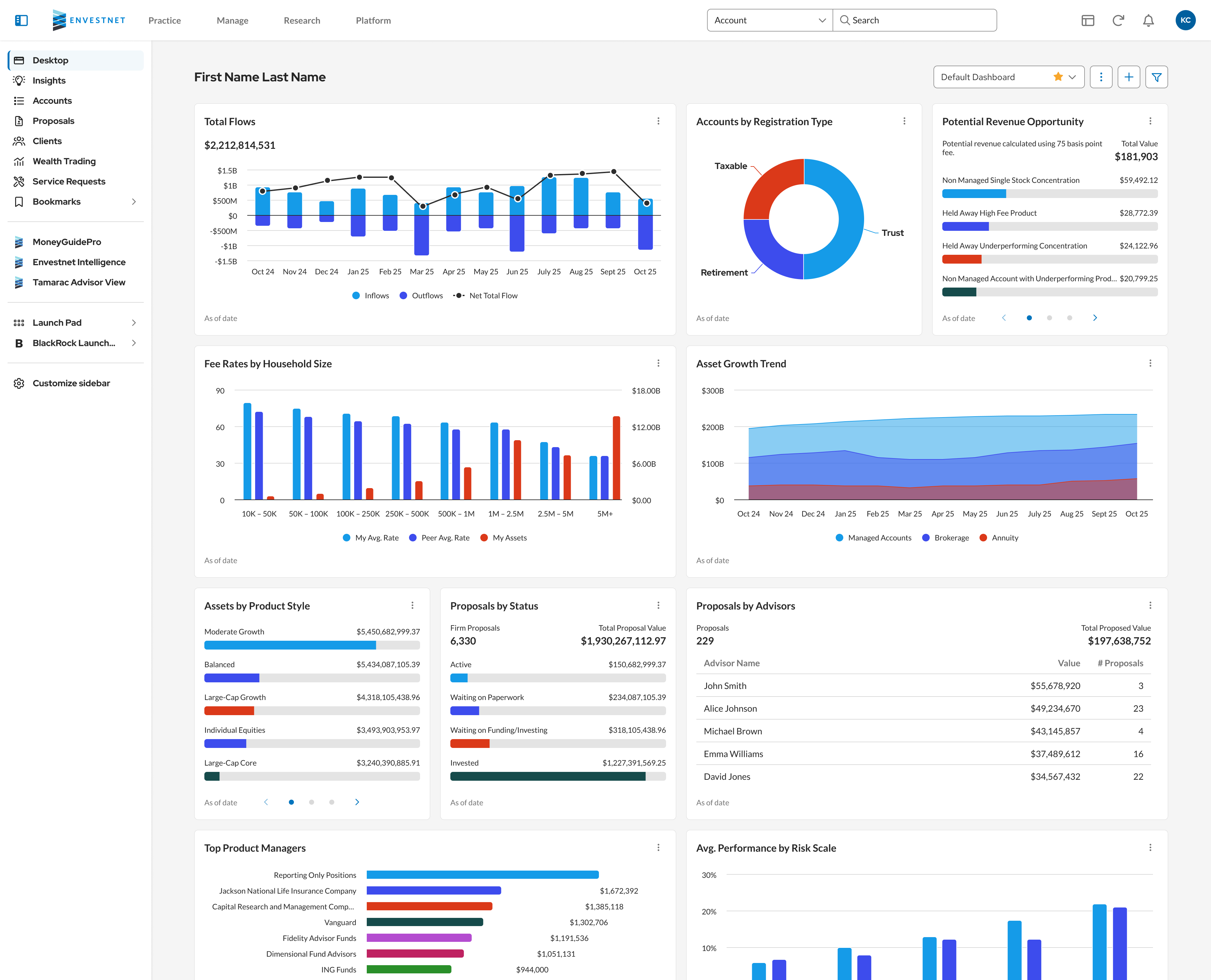
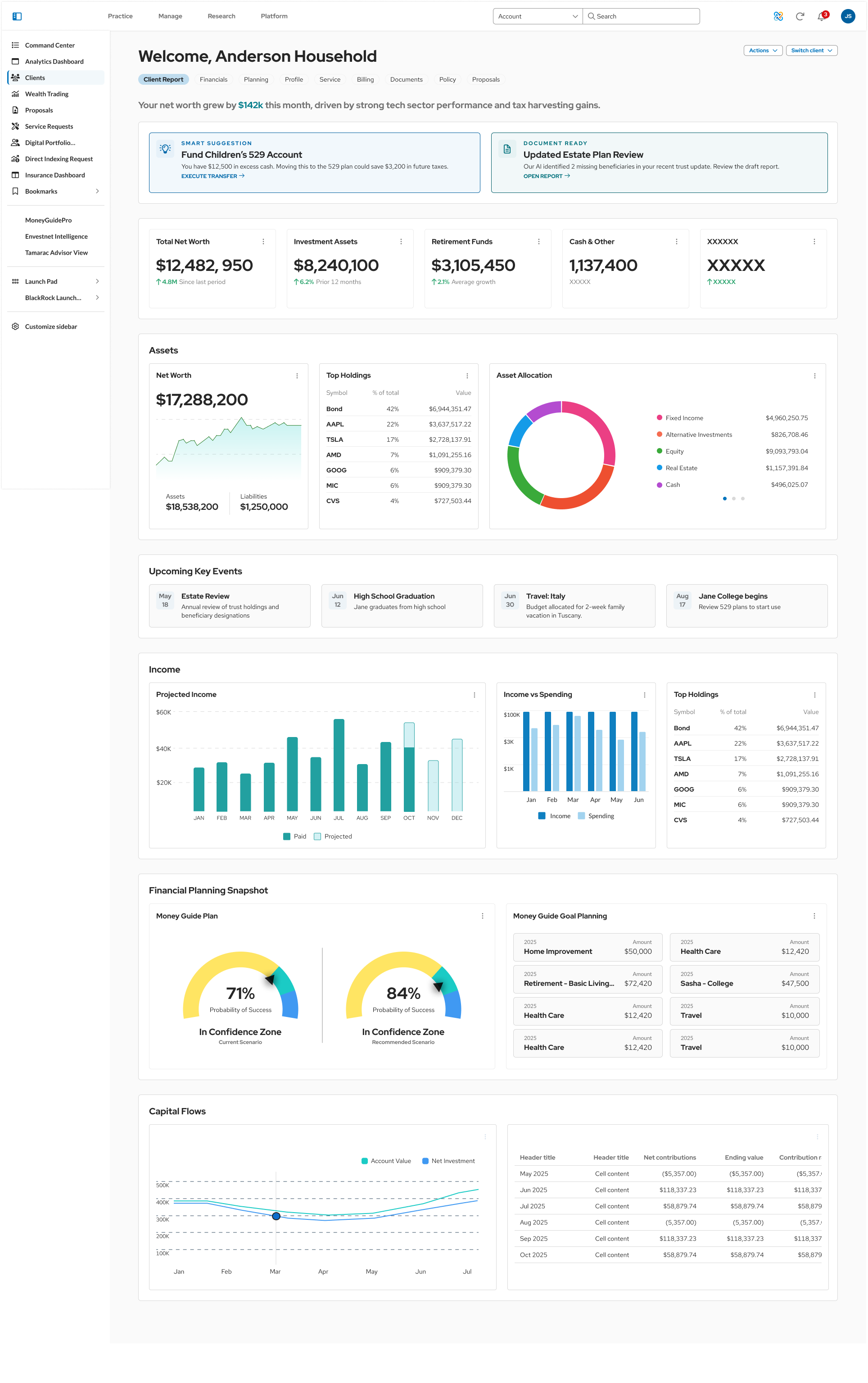
Redesigned dashboard
AfterQuick actions and widgets advisors actually use
How we did it
  1. 01Listen

    Shadowed advisors and ran focus groups to see where time was lost.

  2. 02Set the rules

    Front-end changes first, light and dark mode together, branding built in.

  3. 03Go piece by piece

    Sign-in, then navigation, grids and components, in a set order.

  4. 04Test and ship

    Design review alongside QA, early demos and quick wins for clients.

The work
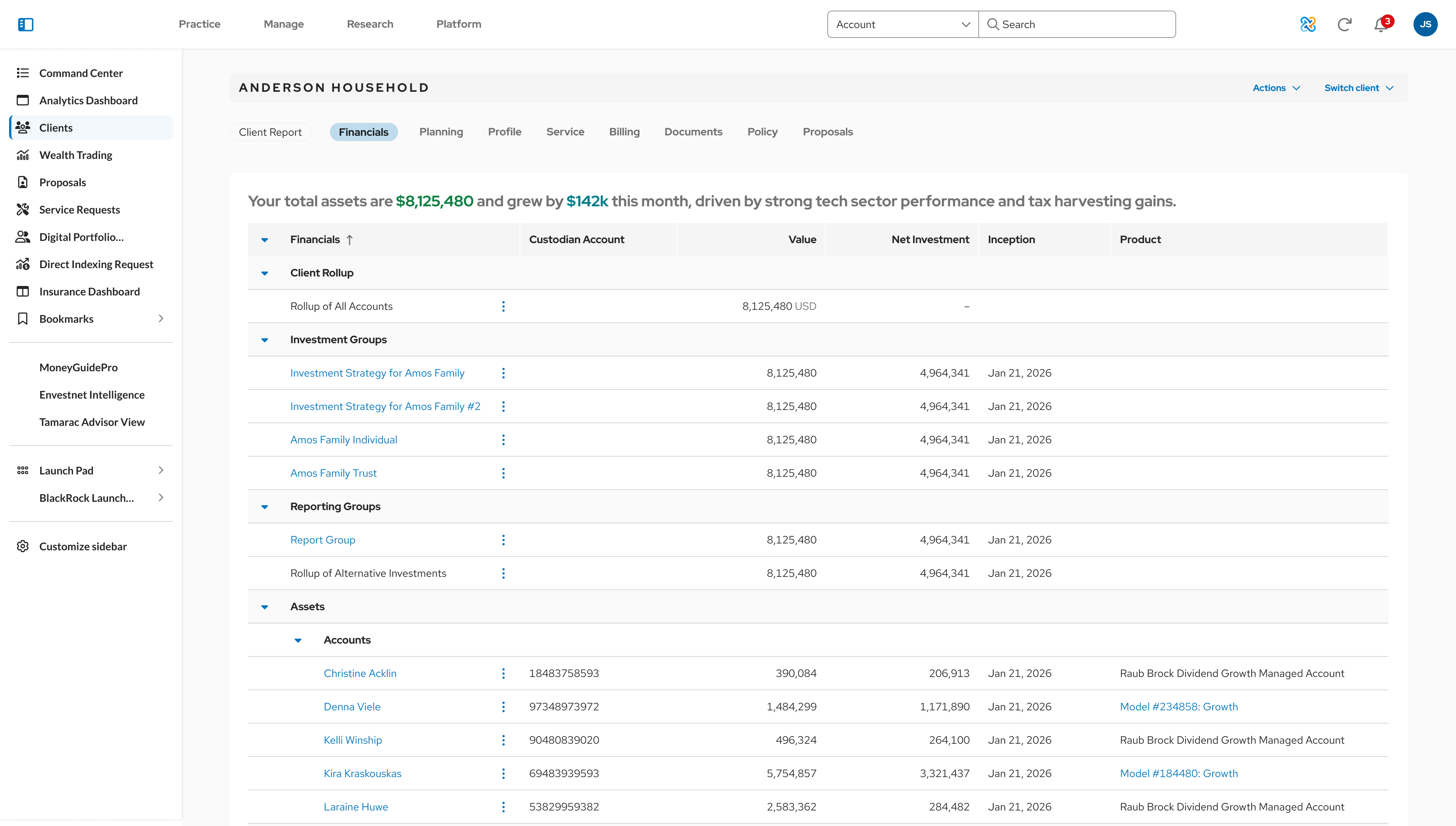
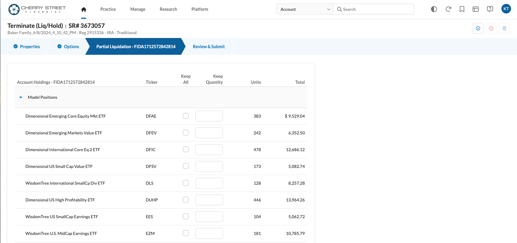
Redesigned household financials grid
GridsRebuilt as a core workflow, with saved columns and sorting per advisor
New sign-in screen
Sign-inThe first component shipped
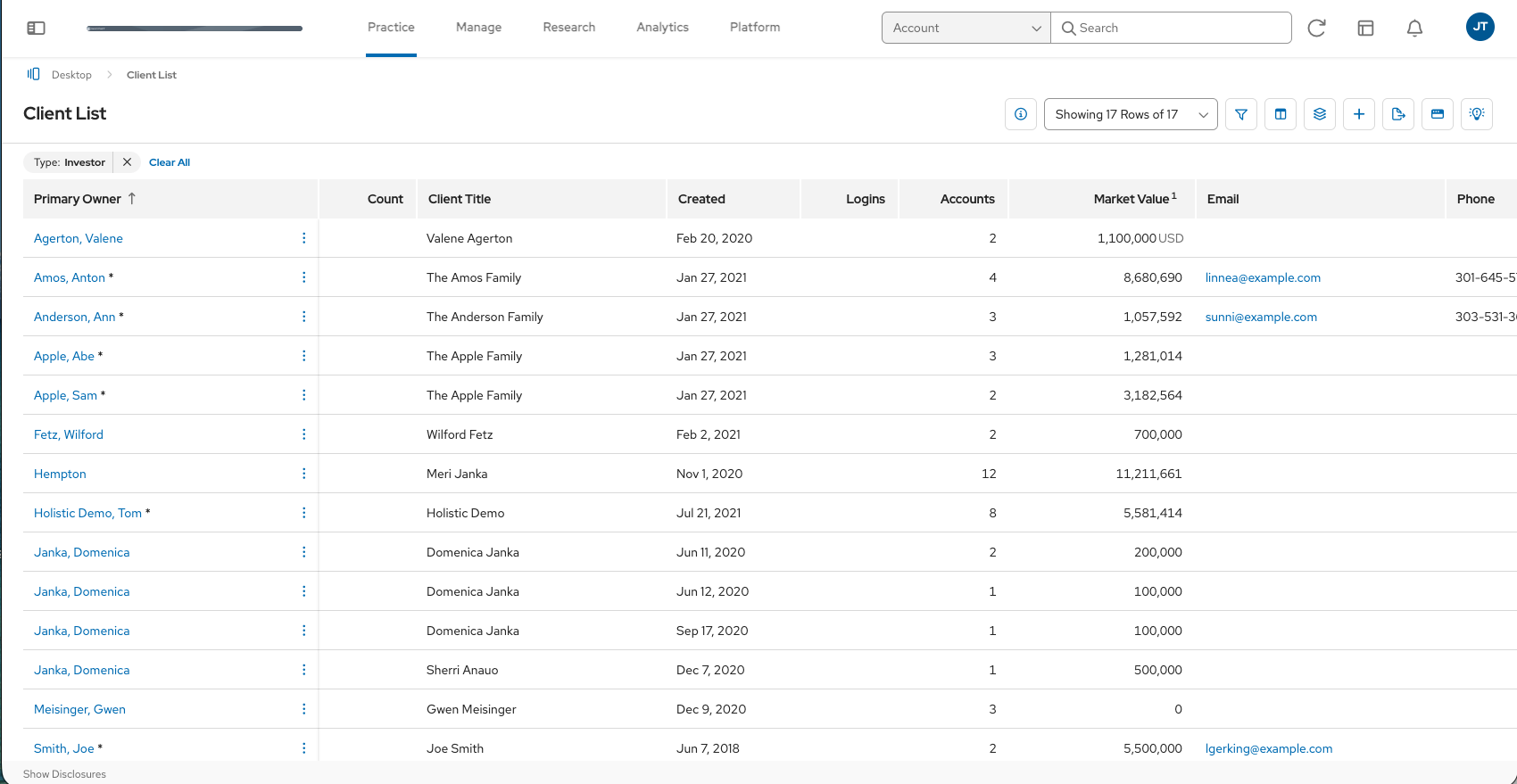
Client list with tabs and filters
NavigationTabs, sub-tabs and bookmarks cut clicks
Up next
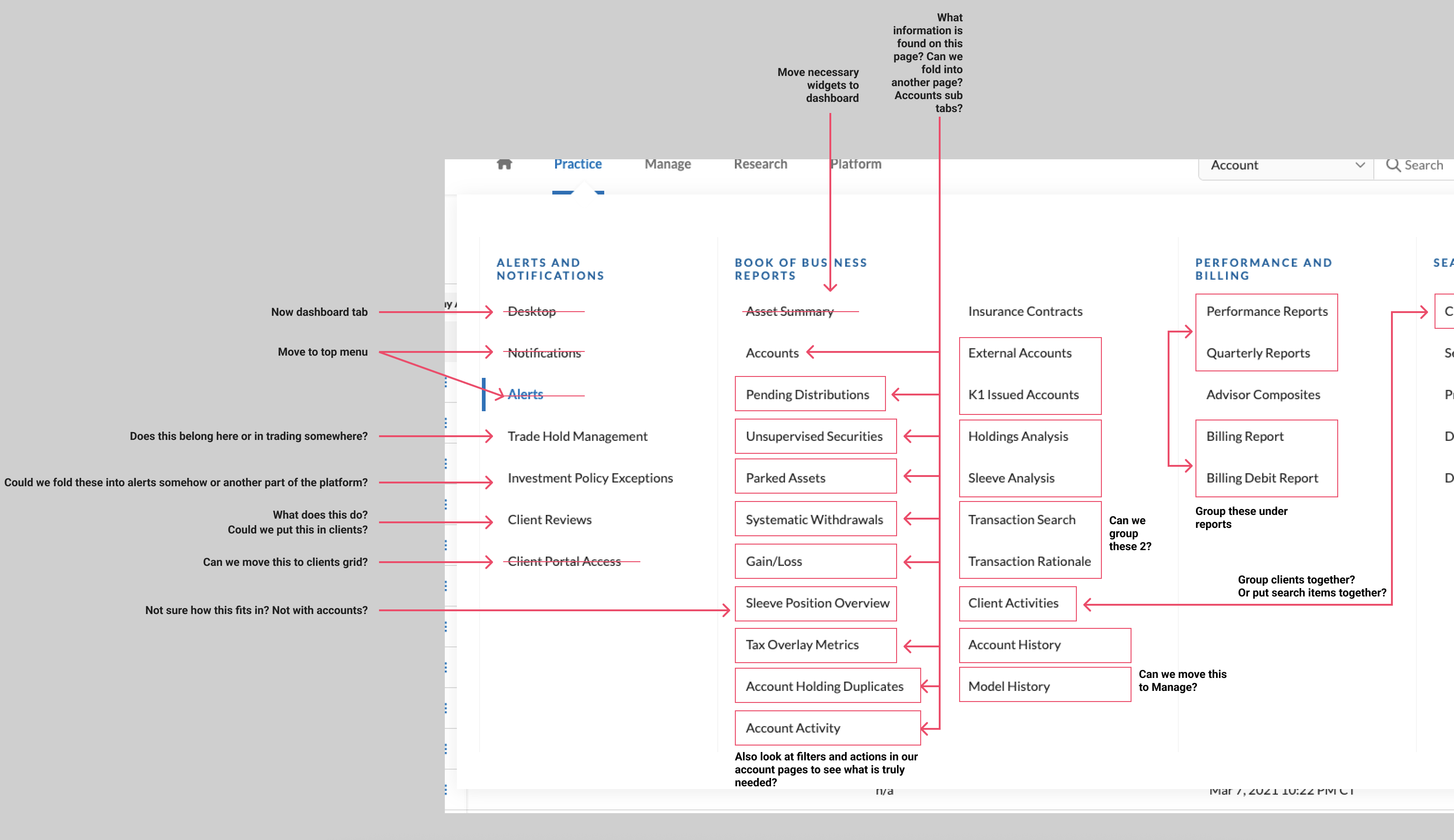
Navigation restructure map
NavigationFewer duplicate pages, grouped content
Client dashboard concept
DashboardMore value as the platform consolidates
Service request workflow
WorkflowsModeling, service requests, households
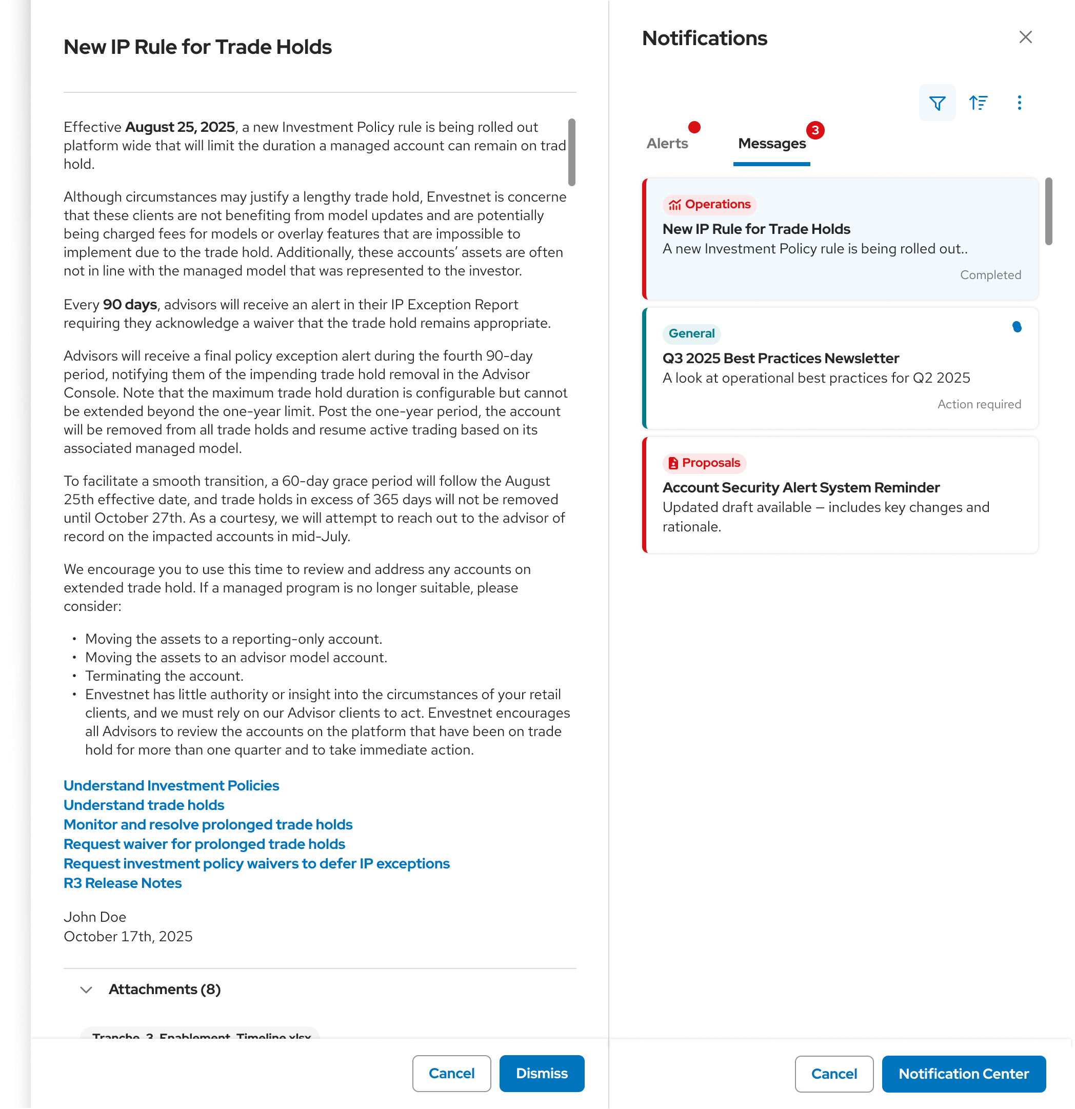
Notification center
AlertsTasks and messages in one place

Let's make something users love.

LinkedIn ↗ Resume ↓